Accessibility features
On this page
- Global navigation
- Skip link
- Collapsible sections
- Session time limit
- Text search
- Keyboard shortcuts
- Page-level keyboard shortcuts
- Rich text keyboard shortcuts
- Bulk selection shortcut
- Edit screen features
- Mini-map
- Editing of headings and elements nesting in rich text fields
- Live preview
- Command palette
- User account preferences
- Browser-level user interface settings
- Sidebar expanded/collapsed
- Rich text toolbar pinned/unpinned
- Mini-map expanded/collapsed
- Side panel
Global navigation
Wagtail provides multiple navigation components that appear on most pages in the Admin interface. These components are as follows:
Skip link
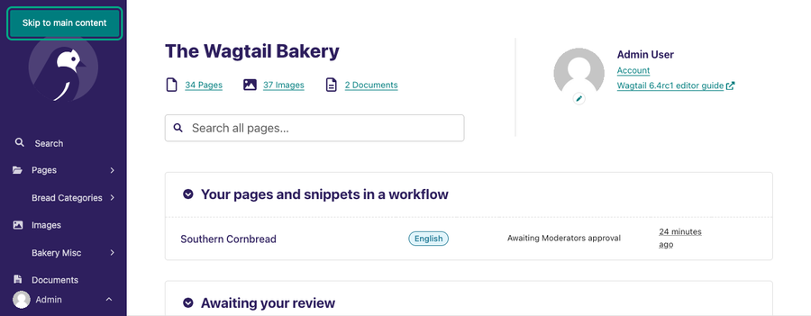
The skip link appears as a Skip to main content button in the Admin interface. If you press the tab key of your keyboard on a newly loaded page, the skip link will appear at the top-left corner of your screen. Once the Skip link appears, press the enter key to activate it. Activating the Skip link moves your keyboard focus to the main content of the current page you’re on. This way, you skip over the Sidebar options to the main content.
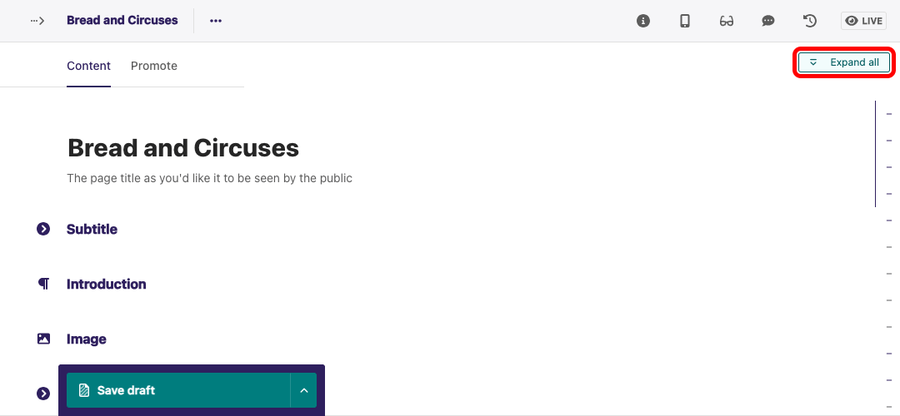
Collapsible sections
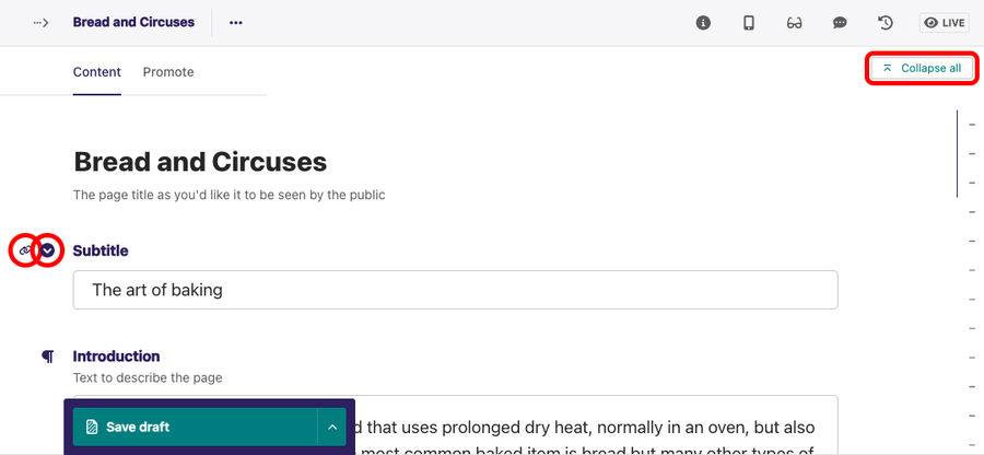
Collapsible sections make it easier to navigate forms. You can find Collapsible sections on the Dashboard and forms to manage pages. You can use your mouse or keyboard to collapse or expand collapsible sections. The collapsible section anchor link also gives you the link to the section you are working to share with teammates or keep for later.
On forms, you can also Collapse all sections in one go, and then Expand all or expand individual sections as needed.
Session time limit
The session time limit in the Wagtail CMS works behind the scenes. A session is created when a user logs in. The default time limit is two weeks but can vary depending on the configuration of the CMS.
Text search
Like most websites, Wagtail supports text search with the use of the Ctrl + F in Windows and ⌘ + F on macOS. Using the text search feature in the Admin interface searches texts that match your search input in the current tab.
Keyboard shortcuts
Find all shortcuts supported on your site with the "Keyboard shortcuts" item within the "Help" menu.
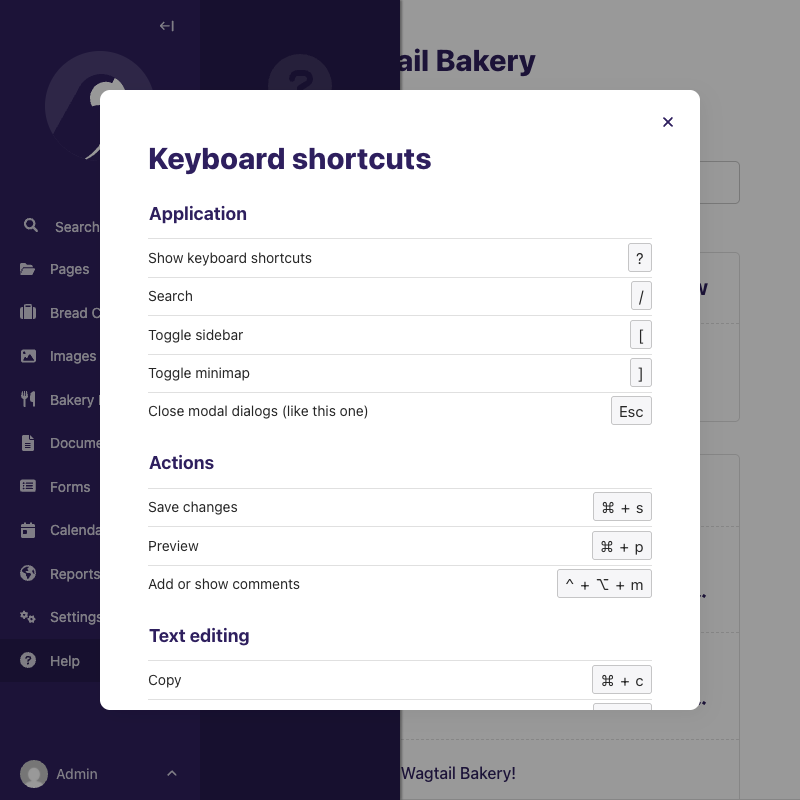
Page-level keyboard shortcuts
On all screens, we support:
- ? to show keyboard shortcuts
- / to focus the search
- [ to expand or collapse the main sidebar.
- Esc to close modal dialogs
On the Edit screen, Wagtail supports additional page-level keyboard shortcuts. These shortcuts are as follows:
- ⌘ + P / Ctrl + P: This shortcut opens up the Live preview. With the Live preview, you can view the structure of your content in different screen sizes.
- ⌘ + S / Ctrl + S: This shortcut saves your work as a draft.
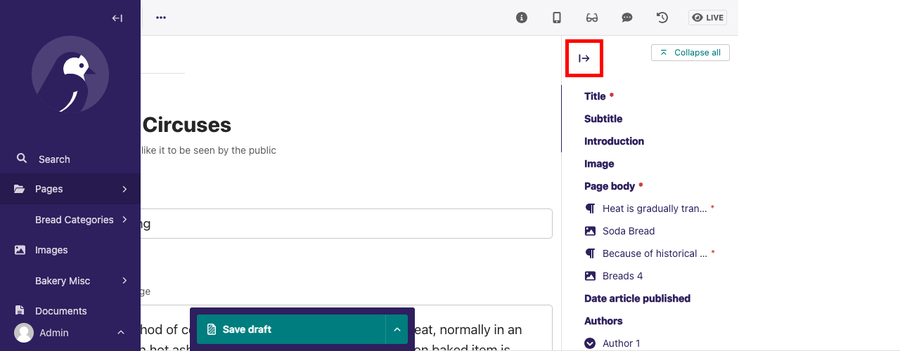
- ] to expand or collapse the mini-map.
Rich text keyboard shortcuts
Within rich text fields, a large number of shortcuts are available, depending on what type of formatting is enabled within the field. For a full reference, see the Draftail keyboard shortcuts documentation.
Here are common formatting shortcuts:
- Paste a URL over selected text to create a link: Ctrl + V / ⌘ + V
- Insert or edit link with the chooser dialog: Ctrl + K / ⌘ + K
- Open link: Alt + ↵ / ⌥ + ↵
- Insert horizontal rule: insert
--- - Text formatting (if enabled)
- Bold: Ctrl + B / ⌘ + B, or insert
** - Italic: Ctrl + I / ⌘ + I, or insert
_ - Underline: Ctrl + U / ⌘ + U
- Monospace (code): Ctrl + J / ⌘ + J, or insert
` - Strikethrough: Ctrl + ⇧ + X / ⌘ + ⇧ + X, or insert
~ - Superscript: Ctrl + . / ⌘ + .
- Subscript: Ctrl + , / ⌘ + ,
- Bold: Ctrl + B / ⌘ + B, or insert
- Block formatting (if enabled)
- Apply heading style [1-6]: Ctrl + Alt + [1-6] / ⌘ + ⌥ + [1-6], or insert
## - Numbered list: Ctrl + ⇧ + 7 / ⌘ + ⇧ + 7, or insert
1. - Bulleted list: Ctrl + ⇧ + 8 / ⌘ + ⇧ + 8, or insert
- - Blockquote: insert
> - Code block: insert
```
- Apply heading style [1-6]: Ctrl + Alt + [1-6] / ⌘ + ⌥ + [1-6], or insert
- Insert a comment (if enabled): Ctrl + Alt + M / ⌘ + ⌥ + M
Bulk selection shortcut
On large listings with bulk editing checkboxes, Wagtail also supports "Shift+Click" selection to mark a large number of items as selected in one go. To use it, keep the Shift or ⇧ key pressed and click on one item to select preceding items.
Edit screen features
The Edit screen accessibility features are specific to the Edit screen. These features are as follows:
Mini-map
The mini-map or “minimap” helps to easily navigate the sections of your content. Placed on the right-hand side of the Edit screen, it contains a list of the different sections within the form and directly links to each of them. Toggle it with the dedicated button, or the ] keyboard shortcut.
The Mini-map also indicates the type of the different sections: headings, subheadings, and blocks within the content.
Editing of headings and elements nesting in rich text fields
This feature allows screen reader users to detect different types of headings within a text block.
Live preview
Live preview allows you to view the content structure of your work in different screen sizes. Live preview supports mobile, tablet, and desktop screen sizes.
Command palette
Typing “/” within the body of your content reveals an interface called the Command palette. The Command palette contains features such as:
- Headings
- Numbered list
- Bulleted list
- Embed
- Link
- Document
- Image
- Blocks
User account preferences
User account preferences are settings that are specific to your account. You can access your user account preferences and notification settings from account settings.
Browser-level user interface settings
Browser-level user interface settings are stored within your browser. You can adjust these settings based on your preference. If you reload the admin interface or log out and then log back in within the same browser, these settings will remain.
Browser-level user interface settings include the following accessibility settings:
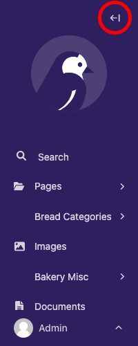
Sidebar expanded/collapsed
You can expand or collapse the Sidebar. Collapsing the Sidebar allows the Dashboard to take up more screen space of the browser. This can also be done with the [ keyboard shortcut.
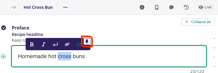
Rich text toolbar pinned/unpinned
Highlighting text within a rich text field displays a toolbar above the highlighted content. This toolbar contains features such as text bold, text italic, and headings. You can pin this toolbar to be always visible to the top of all rich text fields if you prefer.
Mini-map expanded/collapsed
Like the sidebar expanded/collapsed, this feature keeps your mini-map opened or closed on your Edit screen, and will be saved across all of your editing sessions Toggle it with the dedicated button, or the ] keyboard shortcut.
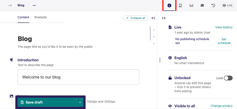
Side panel
The Edit screen has a top header. This toolbar contains the following options:
- Status: This indicates the current status of your page. For more information on the various page statuses available, read Page status.
- Live Preview: Live preview allows you to preview content on different screen sizes.
- Checks: Automated checks flagging possible issues with the page content.
- Comment: This notifies and shows you the comments made on your content by teammates.
When you select an option in the toolbar, the selection opens up as a side panel. You can expand or collapse this Side panel, and which panel is active will be saved across editing sessions.